VERMEG
Prestige Design System
Audible Overview Available
Soundbite Case Study
Client
VERMEG
Timeline
Jun 14th 2020 -> Mar 20th 2021
Role
Lead Designer
Product Designer
UX/UI Design
Strategy
VERMEG is a specialized software house serving key segments in financial services, including Banking Software, Capital Markets, and Digital Transformation. With clients like PwC, QNB, Generali, and Société Générale, VERMEG develops tailored solutions for some of the world's leading financial and insurance giants. To streamline production and improve efficiency, VERMEG needed to build an in-house Design System that would significantly reduce the time required to develop these products for its clients.
I. Responsibilities
✦
Developing a comprehensive design system.
✦
Collaboration with a cross-functional team, including developers in an aim to streamline the design and delivery process.
II. The Problem
The design and development teams were facing challenges with fragmented design practices, inconsistent UI components, and duplicated efforts across projects. This lack of a unified design approach not only slowed down production but also led to higher maintenance costs and longer turnaround times.
Fragmented design practices and inconsistent UI components were leading to inefficiencies, higher maintenance costs, and longer production times.
The lack of a unified design approach across projects hindered consistency and scalability.
III. The Challange
Due to the nature of VERMEG’s clients, being giant banking and insurance companies operating in all continents and with a diverse portfolio of clients the design system had to adhere to a variety of challenges notably
Unique Clientele Visual Identity and Language
Strict Accessibility policies to comply with the market standards
Different profiles of the design system end-users going from none-technical to technical.
IV. The Solution
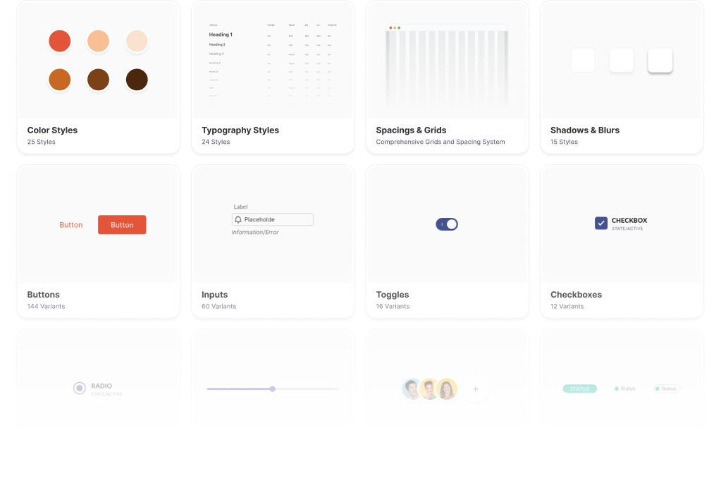
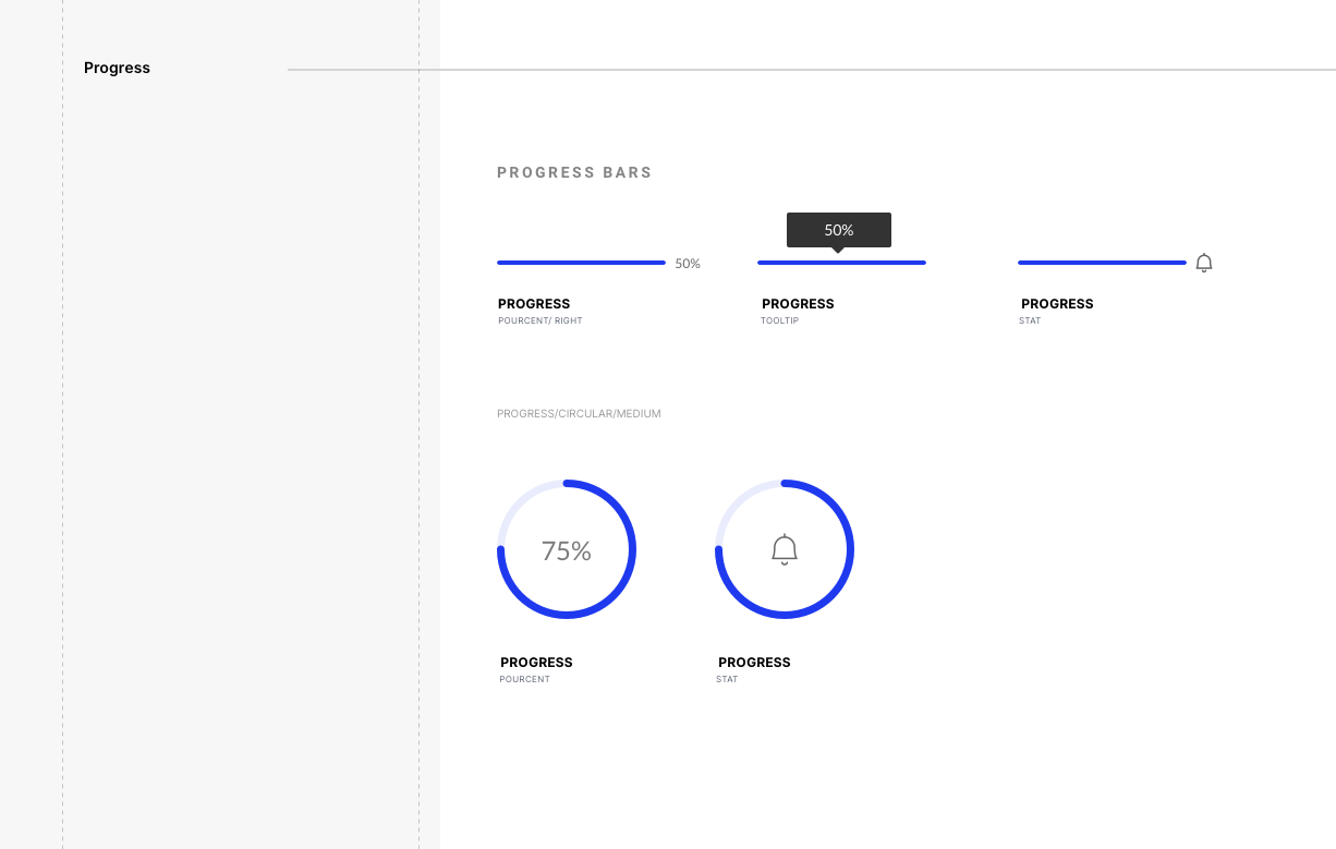
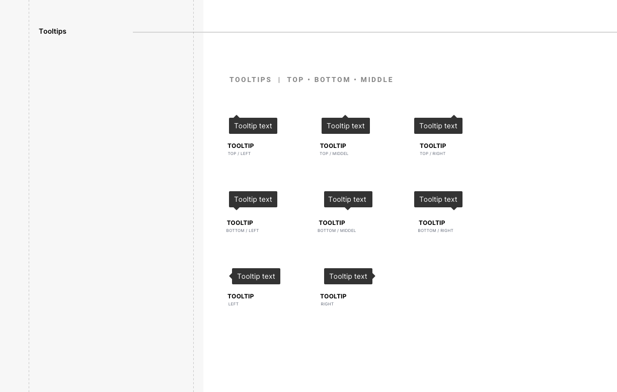
The solution we developed is a robust and versatile design system tailored for VERMEG and its clients, designed to streamline and standardize the design process across various client projects. This comprehensive system features a library of meticulously categorized components, all built using an atomic and customizable design approach with a very well drafted documentation that renders this design system easily understandable.
By integrating these components into a cohesive framework, the design system not only ensured visual and functional consistency but also significantly accelerates development cycles and enhances customization capabilities.
The result is a powerful tool that facilitates efficient, high-quality design production while adapting seamlessly to diverse branding requirements and client needs. If you are interested in knowing more let me break down our approach to it.
V. The Process
As the lead product designer in this project, I had to make sure the end-product was functional and usable in a variety of use-cases.

A. Audit & Discovery
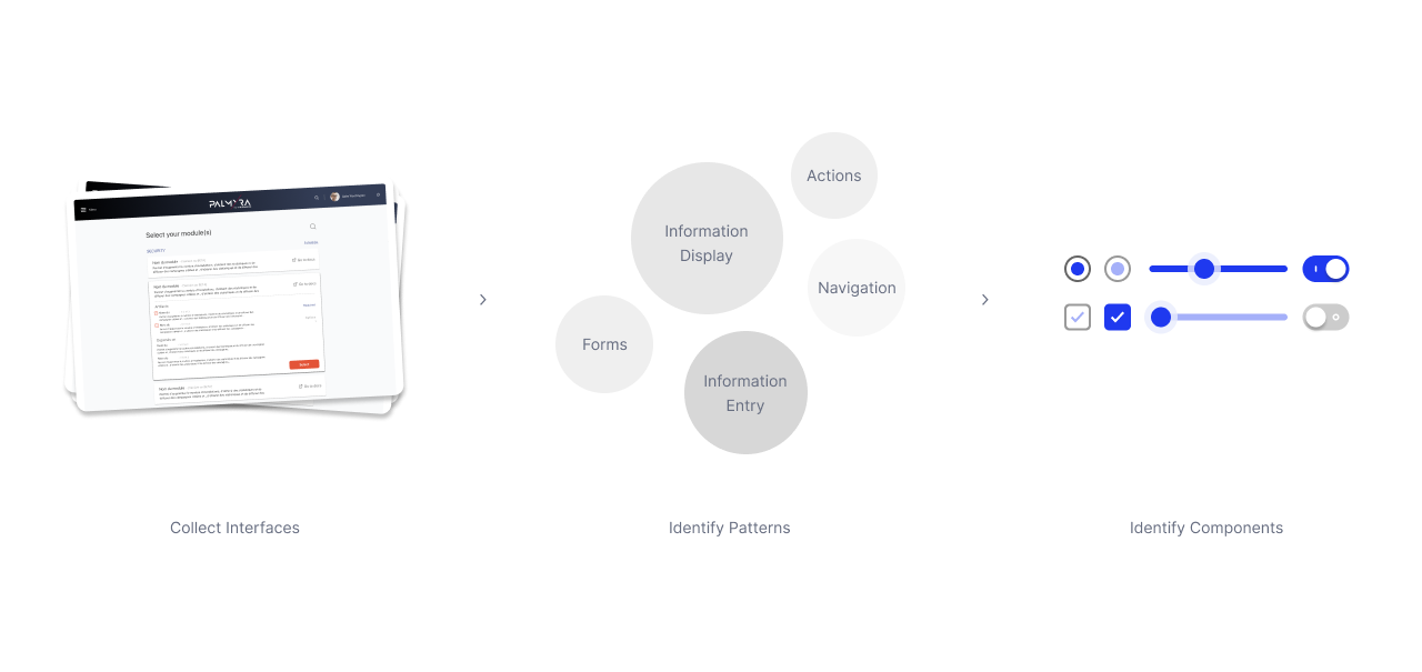
To identify any opportunity to find reusable components I mainly started scouting existing interfaces. This initial step helped me in understanding the current design landscape and finding elements that could be standardized. Saving time and effort in creating new ones from scratch. It also ensured that the new design system was built on a foundation of existing proven elements.
Staying true to existing elements to prevent being disruptive to the existing workflow.
Identifying the components to be included, and the components that are missing from the existing library.
Identified what new components we should create
B. Stakeholder Alignment
To ensure that all project goals and requirements were clearly understood and agreed upon. This step was crucial for aligning expectations and avoiding miscommunication. Engaging stakeholders early and often ensured that the design system met their needs and addressed any concerns or requirements. It also helped in prioritizing components and features based on stakeholder input.
C. Exploring Components Classification
By grouping components into categories, the main Design System users can quickly find and use the components relevant to their tasks. This user-centric approach enhances usability and efficiency. After careful research, I’ve been able to identify a pattern within the components used and finally ended up classifying the components based on the end-user interaction with the components.
Basically the end-user is going to be using the components to do one of the following:
Display/View information from the interface
Input/Entry of information to the interface
Navigate information within the interface
To do one of these actions, our users would have to mainly interact with components, typography, spacing and layouts, and color — Thus we ended-up classifying the design system’s different aspects as follows.
D. Execution: Components Design & Documentation
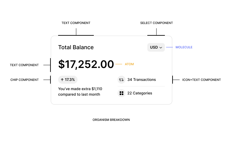
I proceeded to the execution phase, where the real development of the Design System took shape. We adopted a methodical approach, beginning with the creation of atomic-level components—simple, fundamental elements like buttons and input fields.
D. 1. Atomic Design Strategy
I had to identify potential process conflicts and address any risks that could impact the project. Initially, prioritizing components based solely on their frequency of use was insufficient for crafting and perfecting them. To overcome this challenge, we adopted a more structured approach: Atomic Design. This strategy emerged as a natural solution to our problem.

The core logic of Atomic Design is straightforward: begin with the fundamental building blocks before constructing more complex structures. By first identifying and creating the simplest components, we laid the groundwork for more intricate ones. This approach was facilitated by the comprehensive Audit and Discovery phase, which helped us identify essential elements and their relationships. The additional step involved prioritizing nested components based on their complexity and interdependencies. Ultimately, this methodology allowed us to develop an Atomic Design System, categorized by end-user interaction, ensuring that the design system was both scalable and user-centric.
D. 2. Visual Language Integration
The ease of visual language integration of our clients to the design system components were one of the main pillars of our challenges
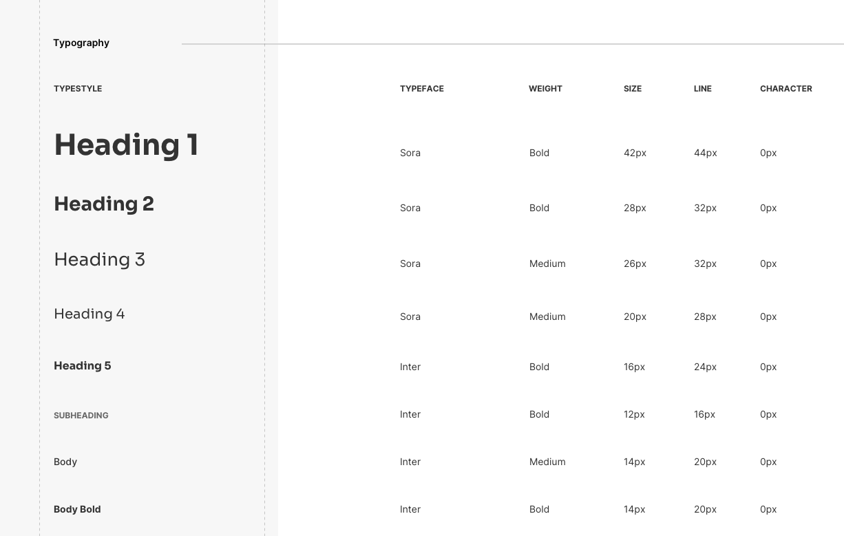
This was crucial to meeting stakeholders' expectations and maintaining brand consistency across different applications. To achieve this, I thoroughly explored every layer of each component, examining visual elements like colors, typefaces, and spacing.
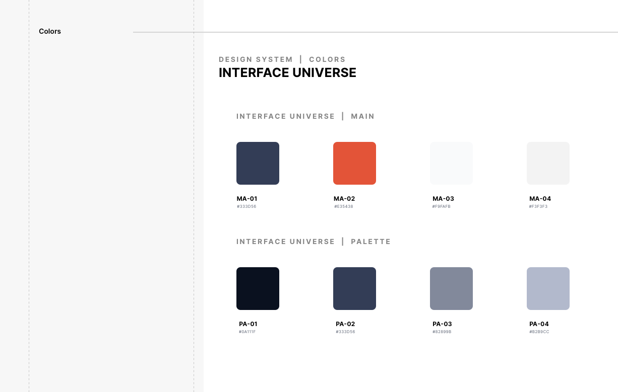
By mapping out these attributes, I made it possible for components to be dynamically adjusted to fit specific branding needs. This approach streamlined customization and enabled seamless integration of the Design System across various projects, preserving a cohesive brand identity adaptable to each client’s visual style
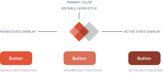
In the 'Button' component, the different states involved multiple colored layers:
✦
Primary Branding Color: This serves as the main color for the component.
✦
State Layer: A transparent black or white layer (at x% opacity) is applied on top of the primary color to create a monochrome variation depending on user interaction.

Picking up all the colors and changing them can be a time consuming task. I didn’t really want our designers and myself struggling to make a cohesive design system identity. In order to solve that I decided to make a color settings playground that enables designers to
✦
Quickly change and preview how the design system would look
✦
Decrease time spent on colors by providing a monochromatic color suggestions
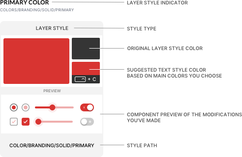
The designer would mainly change the primary branding color in order for the playground card to start suggesting the rest of the layer styles colors.
D. 3. Accessibility
Accessibility was one of our biggest challenges, requiring extensive research and documentation. With our clients being major global brands, meeting accessibility standards wasn’t just important—it was essential. To ensure full compliance, I took a deep dive into every area where improvements were needed, identifying opportunities to make our components accessible and user-friendly for everyone.
Color Contrast
Addressing color contrast involved navigating through a lot of misconceptions commonly found online. While researching accessibility and diving into the WCAG guidelines, I came across some myths that led me to a better understanding of best practices.

For instance, when testing a UI component like a checkbox, the checkmark and its background should be evaluated separately against the label text and its background for accurate contrast results.
Another challenge I faced was how most contrast-checking tools work. Many of them rely solely on HEX codes to determine contrast ratios, but this method doesn’t account for the luminance of the colors being compared, which is crucial for accurate accessibility testing.

In the examples above, the harder-to-read text on the button actually passes the required contrast ratio, while the easier-to-read text fails to meet the standards. This highlights the issue of following the rules too strictly. The WCAG contrast ratios don’t always account for the high luminance contrast of white text. White has pure luminance without hue or saturation, making it highly visible and easier to read in many cases
Through my research and understanding, I’ve made it a priority to apply the necessary contrast ratios thoughtfully, studying each component to ensure they’re accessible and optimized for easy readability.
Components Interaction States
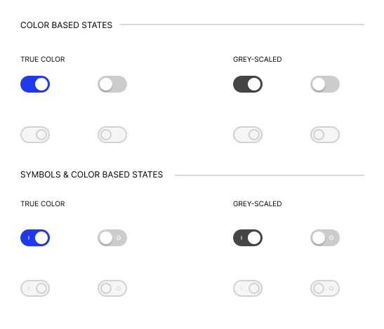
To improve the overall user experience, I ensured that all components provided clear and meaningful information in every state. Take the Toggle component, for example—relying solely on color contrast for state changes wouldn’t be enough for visually impaired users. To address this, I added symbols to make it easy for all users to identify whether the toggle was on or off, ensuring accessibility for everyone.
Keyboard Navigation
To ensure seamless keyboard navigation and meet at least AA WCAG standards, I first needed to identify the purpose and functionality of each component, as well as how users were most likely to interact with it.
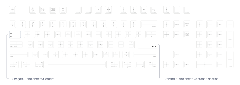
Users typically navigate using one key and confirm their selection with another. It was important to ensure that all stakeholders understood how this keyboard interaction works, its limitations, and the best practices for implementing it
Keyboard Navigated Focused State
The Focus State is a crucial feature in component interactions. It not only assists users with hand disabilities but also supports those with vision impairments, ensuring accessibility for a wider range of users.
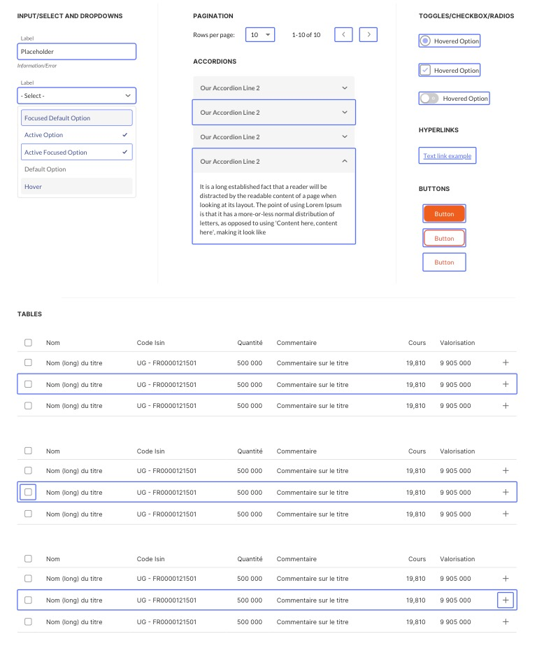
To ensure the Focus State was clearly visible on both light and dark backgrounds while avoiding contrast issues, we reviewed and adjusted the keyboard-navigated Focus State for every component as follows.
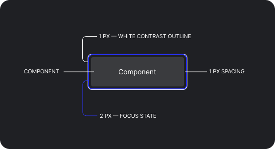
Styling the Focus State with both a border and an outline ensured visibility on both dark and light backgrounds without needing to rework each state individually. The design included:
✦
1px white outline to provide a contrast layer between the component and the background.
✦
2px blue border to indicate the Focus State.
✦
1px space between the component and the focus border to clearly define the selected component.

To further ensure our design system fully complies with WCAG standards, I provided the team with a set of best practice guidelines for implementing Focus States.

D. 4. Iterative Development
Making a perfect design system, or any design from the get go is not an easy task, making a mistake or forgetting an aspect might happen and the way to go is to keep iterating on every design you make. In the case of our design system, I made sure to put an iterative framework in place.

A fruitful example of this that I might showcase would be call to actions, basically I started creating the CTAs based on the patterns we have had in the previously designed interfaces but moving farward a lot of use-cases surfuced and a lot of challanges came up as we kept pushing the design system components farward. A new requirement and challage emmerged an it was about time to revisit the buttons and decide to create a new variation that previously was out of our scoop. stacking buttons was a bottleneck problem as within our interfaces we had to find a new way to group actions to prevent overcrowding the interface — hence the creation of the multi-action button variation of the buttons component.
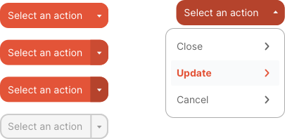
We’ve followed the framework with every component and this really helped us in understanding weather we need a variation, an edit to the existing component or an entirely new component.
VI. The Outcome
The successful implementation of the Design System resulted in a transformative impact on VERMEG’s design and development processes. The Design System, enriched with comprehensive guidelines, provided a robust framework that streamlined the creation of consistent and high-quality user interfaces. This not only improved the efficiency of design and development but also ensured a cohesive and adaptable approach across various client projects.
The final result was a versatile and scalable component library that met diverse client requirements while maintaining brand consistency. The system’s ability to easily customize components for different visual languages allowed VERMEG to deliver tailored solutions quickly and effectively. The rigorous testing and validation process, supported by the detailed Design System Guidelines, ensured that the components were practical, user-friendly, and aligned with real-world needs.
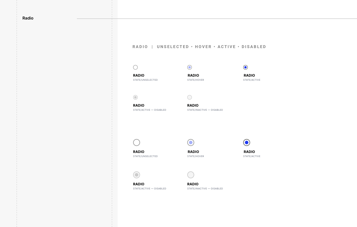
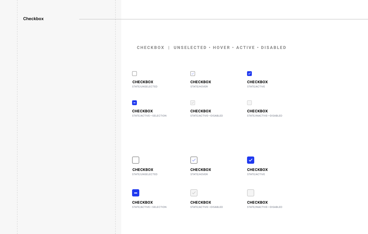
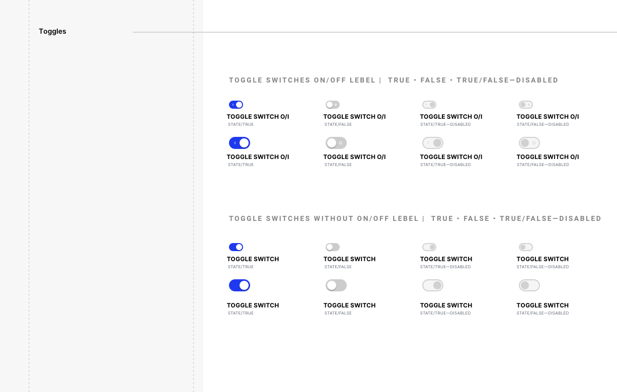
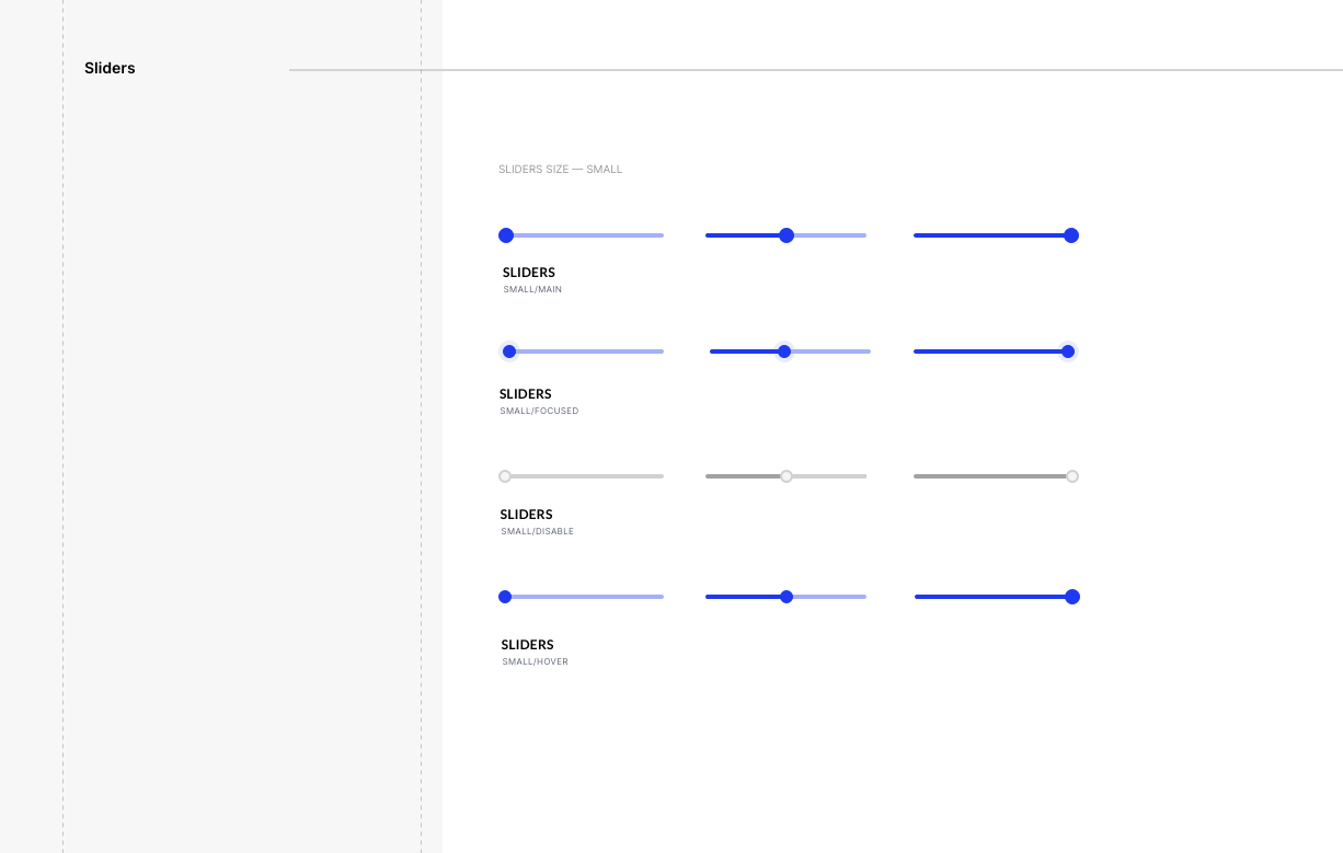
x12 Faster POC Production Time
Prestige Design System helped VERMEG build POCs 12 times faster going from 6 months production time to merely 7-15 days production.
80% Reduction in design inconsistencies across projects
Prestige Design System helped VERMEG stay consistent across all interfaces since its implementation and use.
Learnings
Working on the VERMEG Design System was a profound learning experience that honed my skills over a year of hard work in design thinking, collaboration, and problem-solving. One of the key takeaways was the importance of a thorough audit and discovery phase. This phase was essential for laying the foundation for a scalable and efficient Design System, reinforcing the value of investing time upfront to understand the full scope of a project.
The iterative development process taught me the value of flexibility and adaptability. By continuously revisiting and refining our components, I learned how to integrate feedback effectively, ensuring that the final product met both functional requirements and user needs. The importance of clear documentation also became evident, as the Design System Guidelines we created proved invaluable in ensuring consistency and ease of use across different teams and projects.
Perhaps what I didn’t expect was the deeper appreciation for the power of a user-centric approach. By categorizing components based on how end-users interact with them, we were able to create a more intuitive and accessible Design System that truly met the needs of our clients and their users. This was a very fun and amazing experience. I would love to thank VERMEG’s team that were more than supportive in making this project a cataclysmic succuss!

